Tessa Spanton SWA Artist, tutor, writer
TESSA SPANTON SWA ARTIST, WRITER AND TUTOR
Welcome to my blog.
This is where I write about some of the things that inspire my work,
news of exhibitions and works in progress
Sunday, 26 October 2014
Painting Picture Frames
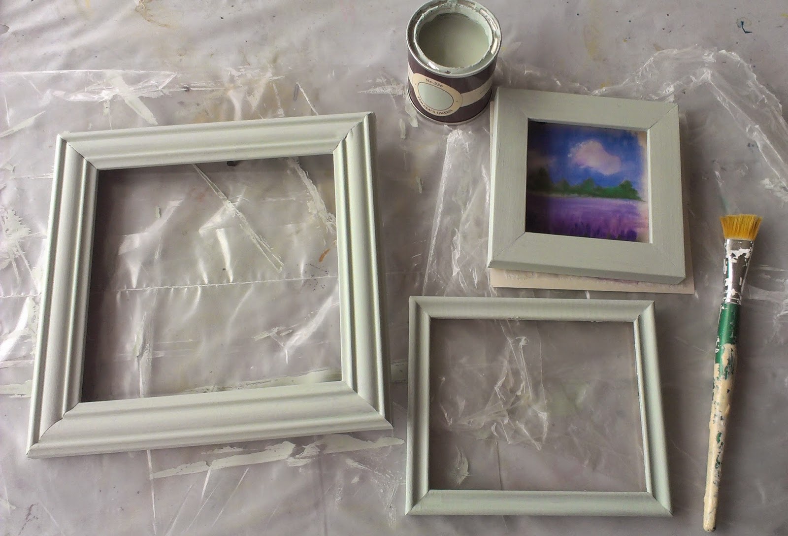
I am painting a few picture frames ready to frame some small works for The Corner Gallery's gifts for Christmas show.
I am using Farrow and Ball's emulsion paint. First I sand the surfaces to be painted and dust them down. I use an artist's flat brush. It takes up to 3 coats depending on the original colour of the frame. It gives a lovely velvety matt finish. The colour I am using this time is Teresa's green. It's a very soft grey green that goes well with lots of my paintings. This group will mostly be the local lavender fields painted on silk. I buy a sample pot which goes quite a long way on smallish frames.
Tuesday, 21 October 2014
Silk Scarf yellow and grey geometric pattern
I have used AV Vallejo black outliner and Marabu iron fix paints on a ponge 5 scarf. I worked on both ends in turn until the design met in the middle. It was not drawn out first but evolved as I worked on it.
A close up of one end
The ready hemmed blank silk scarf is attached to an Arty's Easyfix frame while being worked on.
Both are available to buy by mail order from Silkcraft click here for the frames and here for the scarves.
I find this type of frame is useful for painting scarves. I have a square frame and an extension kit. The system is flexible and can be set up for different sizes of scarf, oblong or square. The silk is held away from the frame rather than pinned onto a wooden frame which means that ready hemmed blank scarves can be painted right to the edge.
I find it a bit fiddly to set up and for work where the edges will not be seen prefer to use a wooden frame.
TIPS Don't make the rolled edge too wet. Be on the look out for moisture from the rolled edge moving into the drying scarf and making watermarks.
I painted this scarf in small sections and dried them one at a time with a hair drier. This has to be watched too as one colour can spread along inside the rolled hem and get into the next section.
Finished scarf 135x35cm approx
Friday, 12 September 2014
Painting Outdoors Smart Tools
The second of my two articles about painting out of doors is in the October issue of the Leisure Painter magazine which is out today.
I show how to scale up and how to make some simple tools, a viewfinder to help with finding a composition and an angle finder for measuring angles, useful when drawing buildings.
The magazine can be bought from larger newsagents or online here and is also available in digital form.
Sunday, 7 September 2014
florum 2014
I have 7 paintings and some prints and cards
in florum's exhibition.It is on till Sept 13th more details click here |
|---|
Himalayan Poppy an original silk painting by Tessa Spanton (c)
Rose Burgundy Ice an original silk painting by Tessa Spanton (c)
Darwin tulip an original silk painting by Tessa Spanton (c)
Iris ensata an original silk painting by Tessa Spanton (c)
Iris spuria an original silk painting by Tessa Spanton (c)
Hellebores an original silk painting by Tessa Spanton (c)
Saturday, 16 August 2014
Pack Smart
Torwards Godrevy (c) Tessa Spanton
This little watercolour sketch was painted out of doors on holiday
size 1 1/2 x 6 in
A little sketch done on a day out or on holiday holds memories and a lasting reminder of the place.
I wrote two articles about painting out of doors. The first of these was in the September issue of the Leisure Painter magazine 2014. It has the title Pack Smart and offers ideas for getting started painting outdoors and how to travel light.I put together several kits: The Micro, the Mini, The Essential and extras are light enough not to put me off taking them out with me.
The Micro kit weighs about the same as a banana. It includes a postcard sized watercolour pad, a water brush and various recycled things such as some blister packaging from pills or throat sweets, the lid from some food packaging and a small square plastic box that had Fererro Rocher chocolates in it. Well someone had to eat them!
The Micro Kit
The Mini Kit 1.Closed 2. Open
This includes two of my favourite items. A good quality folding brush made by Pro Arte and Winsor and Newton's amazing field box filled with my own choice of their Artist's colours. I have several of Pro arte's folding brushes. The one below is a round and the size is around 10. I also have a smaller size round, a flat and a filbert. I used the flat for the sketch above.
The field box has it's own built in water bottle, palette areas and water container that doubles up to keep the box closed when not in use. Remember to empty it if you take it through customs.
The Esssential
Mini kit plus clip folder, tin for pencils, waterbrush etc and 1/8th imp cartridge and watercolour paper.
Plus sometimes a very lightweight fishing stool
The Full Works (sometimes the fishing stool comes too.) I use this if I want to work larger and don't have to walk too far. I would only carry this with me if I am going out with the intention of painting. It holds 1/4 imp paper, a water bottle, a collapsing water pot and lots of brushes. There is room to stash the mini kit as well. The case is made by Mapac and has a comfortable shoulder strap.
My second article Smart Tools was in October 2014 and the blogpost is here
To find out more Leisure Painter is available from some newsagents or online here as a hard copy or digital version
Labels:
Cornwall.,
painting out doors,
plein air painting,
St Ives
Monday, 26 May 2014
The Desert Collection in the Algarve
Sandstone Cliffs Praia de Falesia, Algarve 1 and 2
watercolours by Tessa Spanton (c)
Winsor and Newton Desert Collection limited edition professional watercolours.
Transparent Phthalo sapphire, Indian red deep, transparent orange,
Opaque yellow titanate, gold brown with mixes shown above,
and dark brown ( shown below right)
I bought these paints to take to the Algarve with me as I thought they looked ideal for the reds and ochres of the sandstone cliffs.
Phthalo sapphire is a beautiful blue that is complementary to the transparent orange. They really sizzle next to each other. The transparent orange is an intense colour bordering on red,
I don't usually buy tubes of brown as I prefer to mix my own and the gold brown looks similar to gold ochre but I decided to buy them all. I wanted to explore the colour interactions when set next to one another and to see what mixes I could make from them.
I also made greens from this group. I used these for the pines growing on the cliffs. The greens produced are fairly muted.
above View from Porto Bay Falesia watercolour Tessa Spanton (c) painted en plein air.
I have tested how the colours react with each other on wet watercolour paper,
and made some comparisons with other colours I have, i will put these and my conclusions in another post.
above View from Porto Bay Falesia watercolour Tessa Spanton (c) painted en plein air.
I have tested how the colours react with each other on wet watercolour paper,
and made some comparisons with other colours I have, i will put these and my conclusions in another post.
Saturday, 3 May 2014
The Market in Funchal Madeira
Mercado dos Lavradores in Funchal, Madeira, Portugal
I did the under painting using FW inks on wet 200lb Bockingford paper. These are intense colours and I used then straight from the bottle. It comes with a handy dropper attached to the lid.
Onto this I collaged some paper torn from a magazine. I wanted some text in Portuguese and found some in a magazine I had brought back from Madeira. Even better there was an article about the market written in both Portuguese and English. I used pieces of this for the floor.
I worked on top of these using Atelier Interactive acrylics with plenty of flow medium. These are slower drying than acrylic paints usually are so I had plenty of time to blend colours. I spent several days on these paintings adjusting colours and tones, a luxury I don't usually have when painting on silk. I worked on them as a pair.
I mounted them like watercolours and framed them in light ash frames.
Here they are labelled and ready to be submitted to the Society of Women Artists exhibition at the Mall Galleries complete with paperwork.
Today 2 weeks later the letter arrived with the form with the result. As I opened it I am wondering 'would there be an A or a R written next to the titles?' Good news this time, both have been accepted.
Subscribe to:
Posts (Atom)


.jpg)
.jpg)
.jpg)
.jpg)
.jpg)
%2B(443x640)%2B(138x200).jpg)
.jpg)
.jpg)

.jpg)
.jpg)
.jpg)
.jpg)
.jpg)
.jpg)
.jpg)


